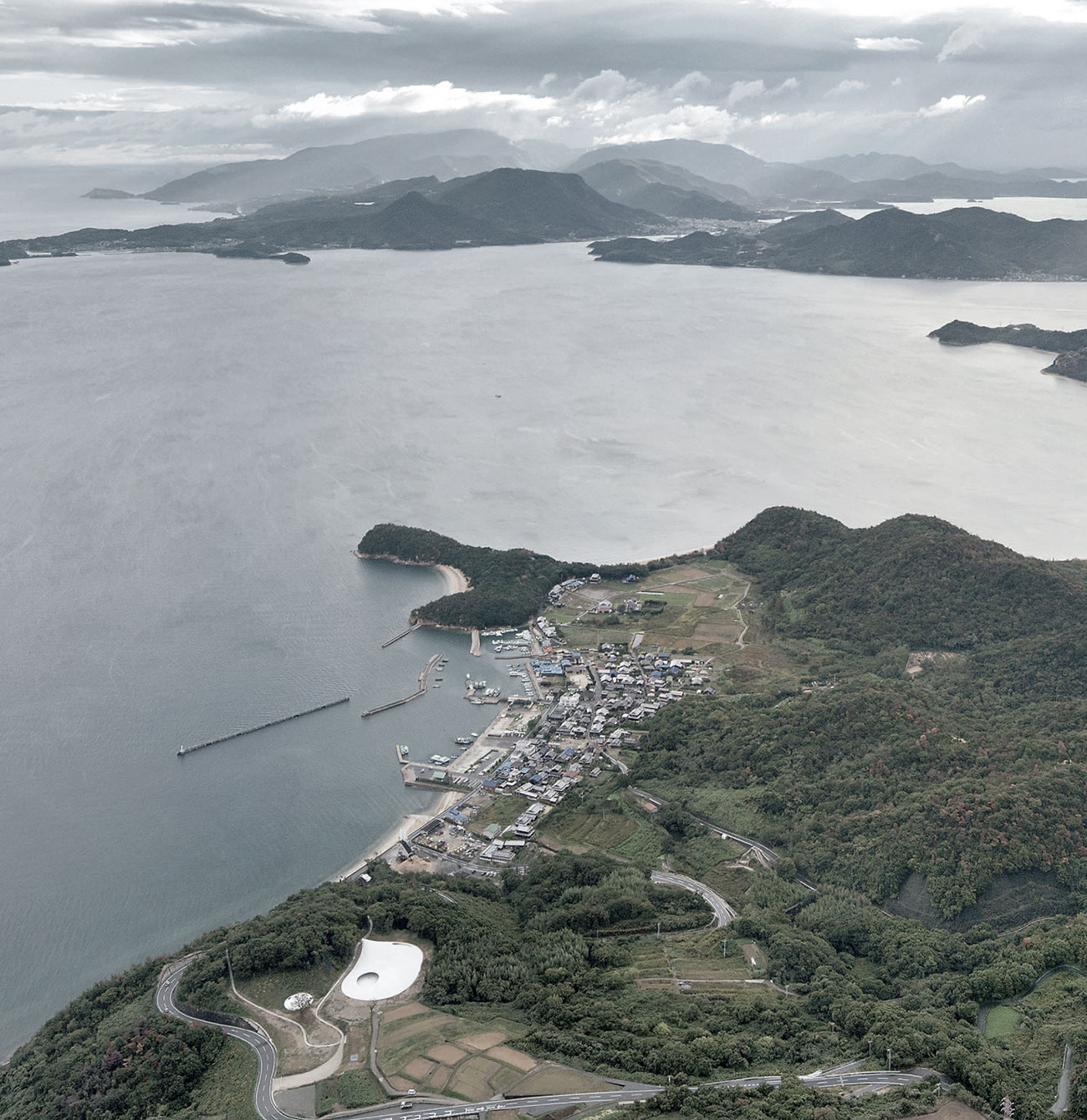
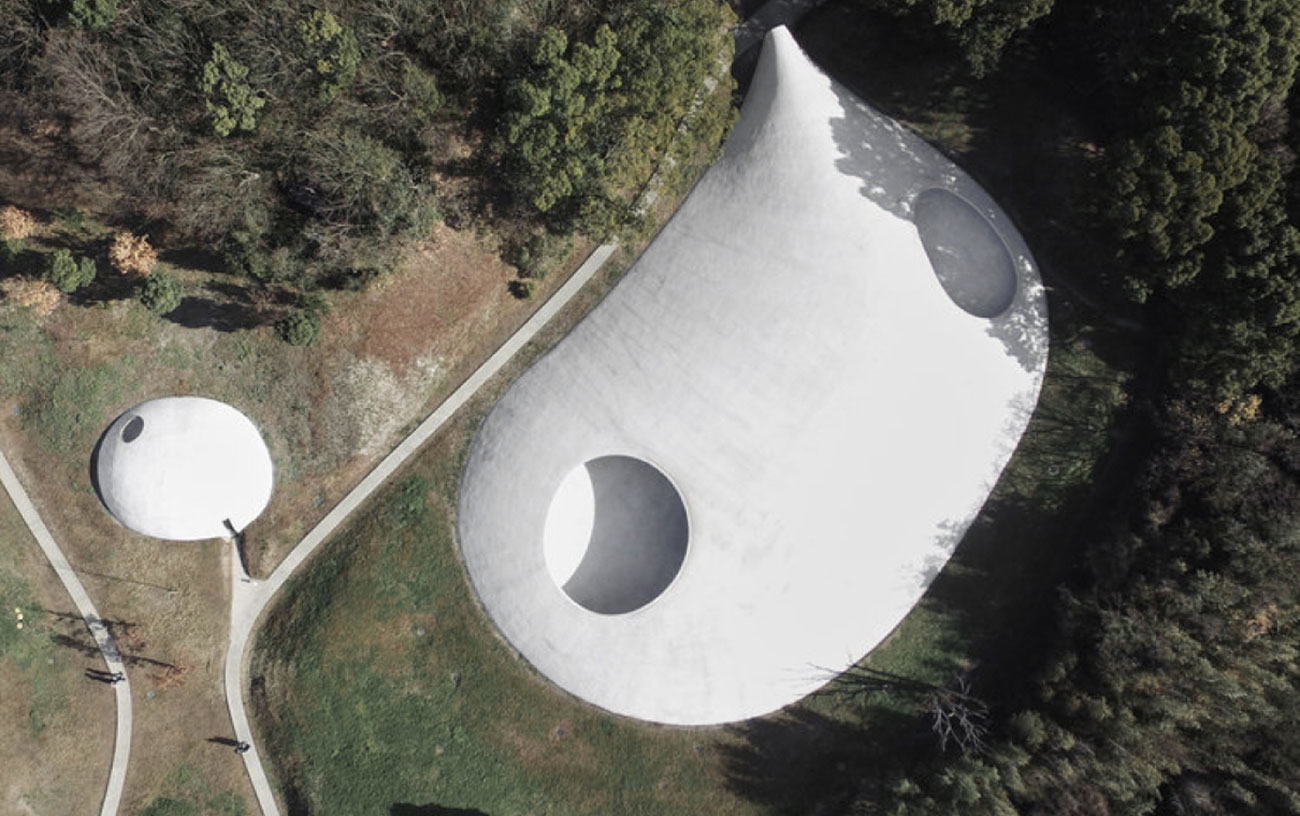
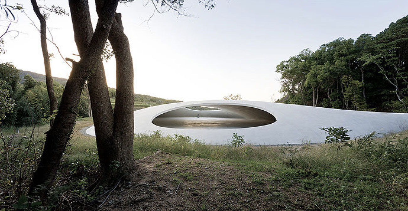
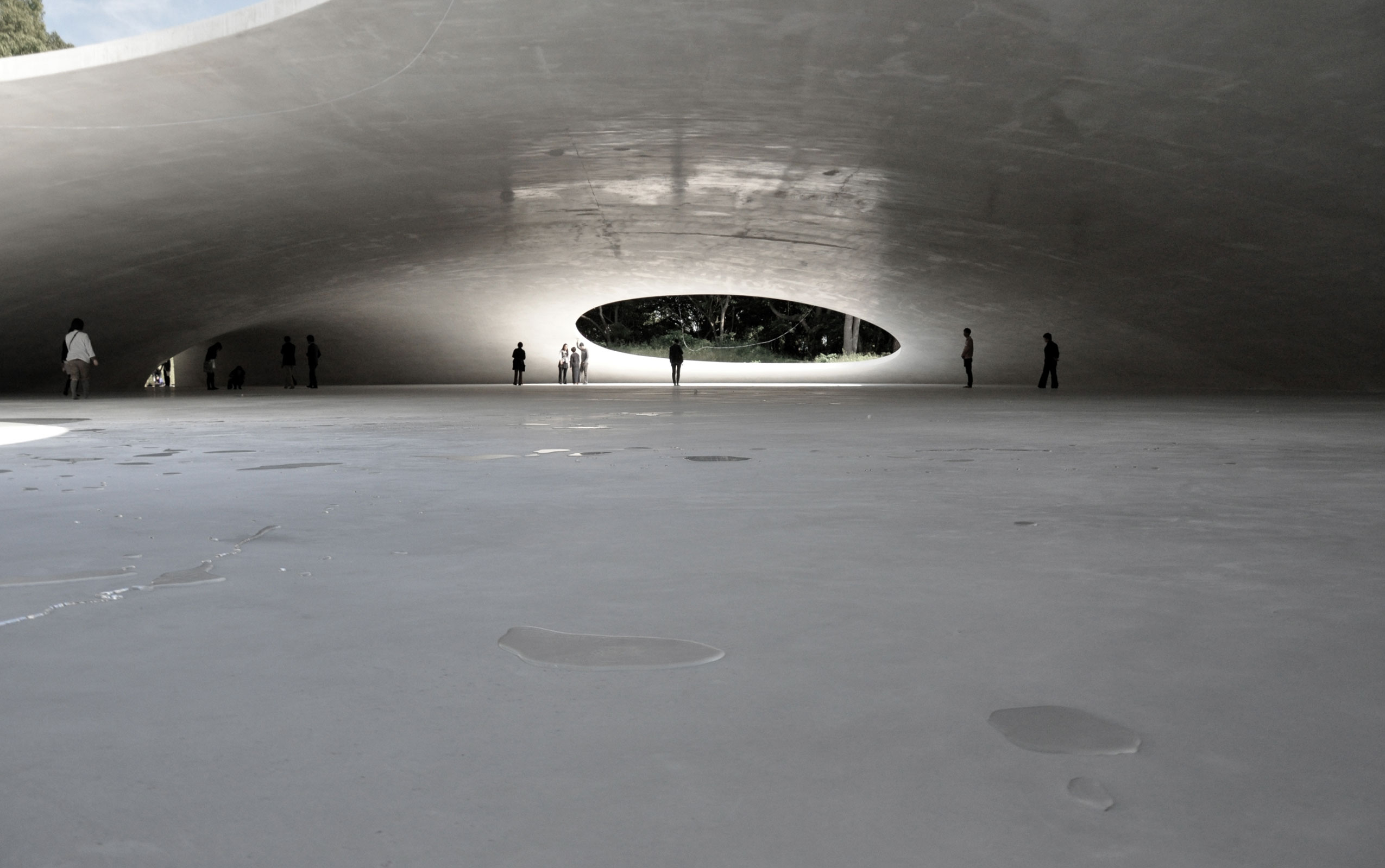
Gently nestled on a site of soft contours, with its shape this museum mimics how a droplet of water falls on the rice fields that characterize the landscape of the Japanese island of Teshima, in Seto Inland Sea.
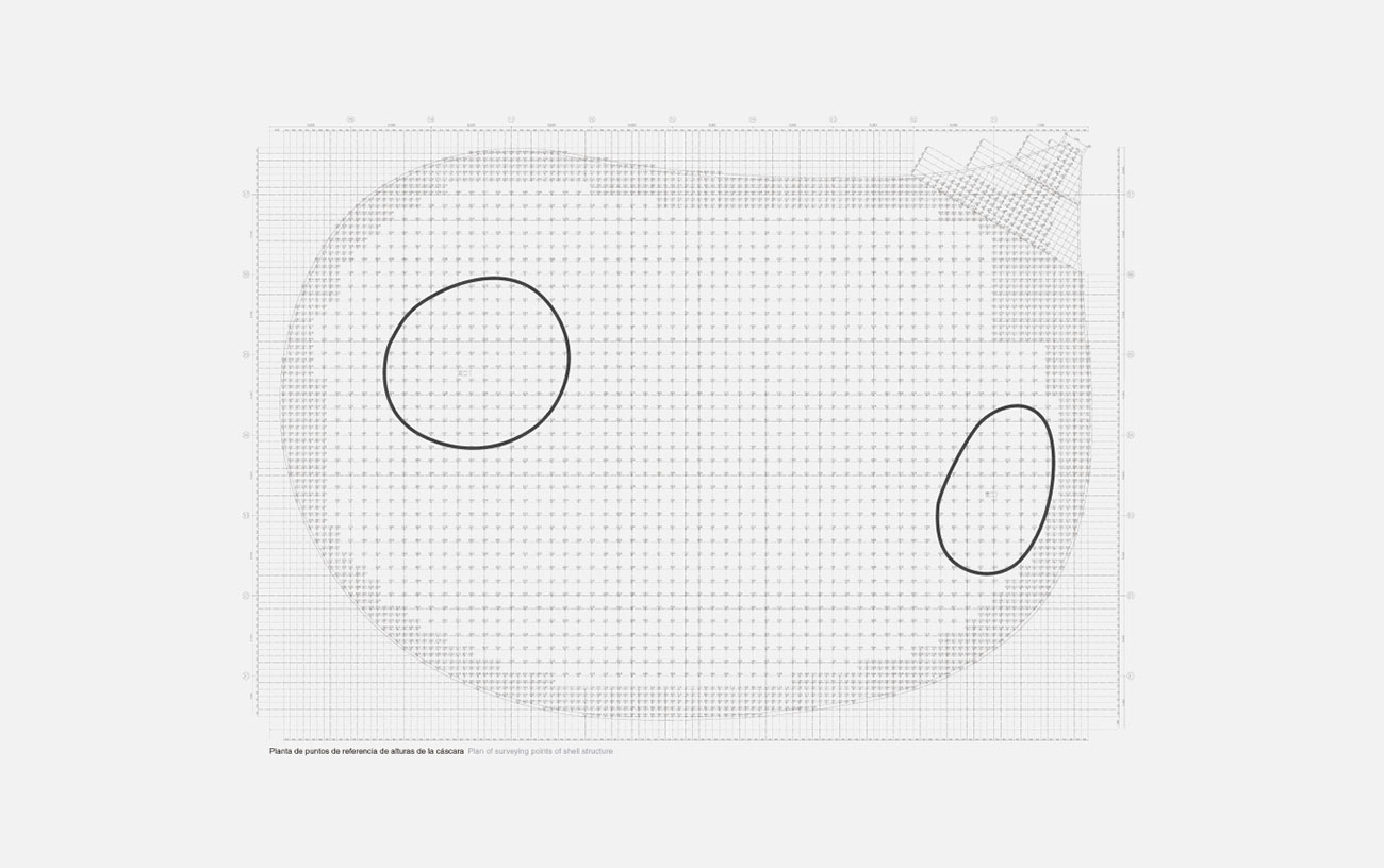
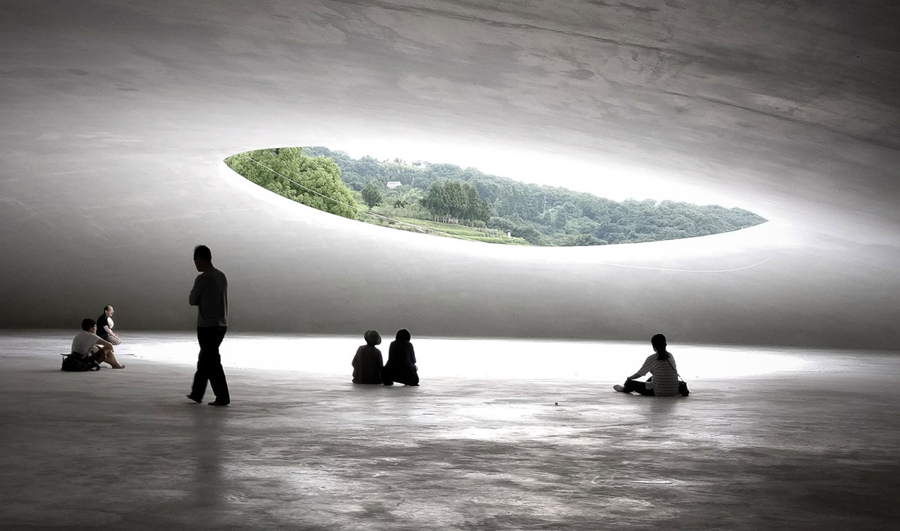
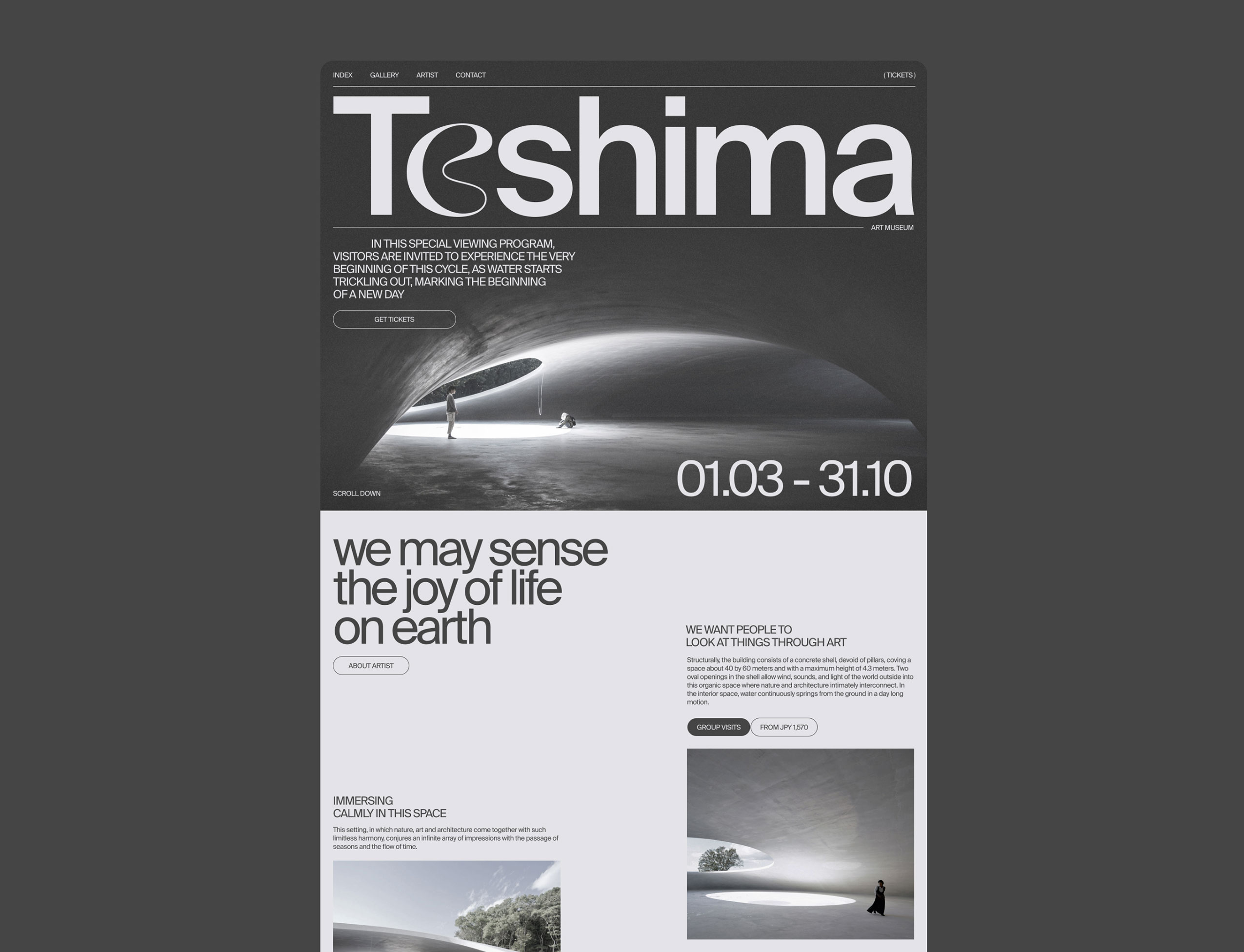
Two light shells of white concrete measuring 25 centimeters thick and with organic forms, aside from a small buried reception area, accommodate the museum facilities, connected by a path that offers views of the natural environment and different perspectives of the project. The largest ‘droplet’ harbors the only exhibition hall, an open-plan and intense space of 40×60 meters with two elliptical openings cut out of the domed roof surface.
These large outdoor openings give views of the exterior and bring the outdoor life inside – light, breeze, rain and fauna. The museum was designed to constitute an artwork that interacts with the environment’s atmosphere, merging landscape, art and architecture in a spatial entity.
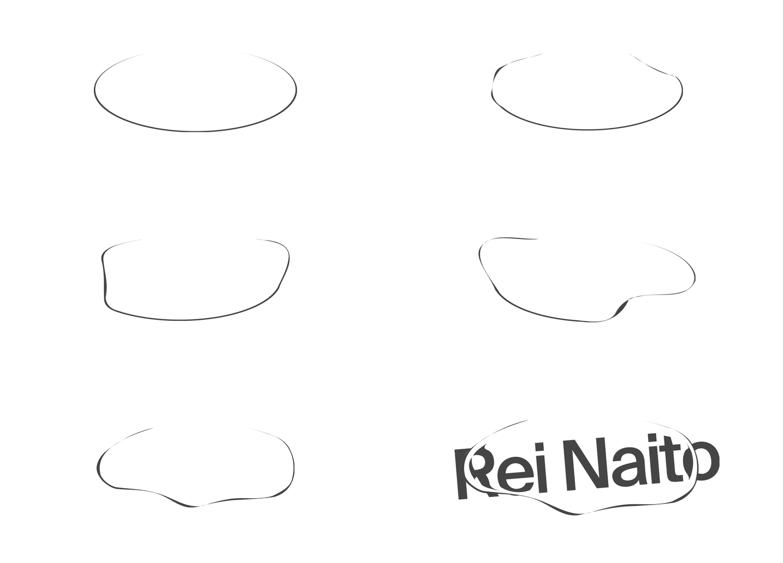
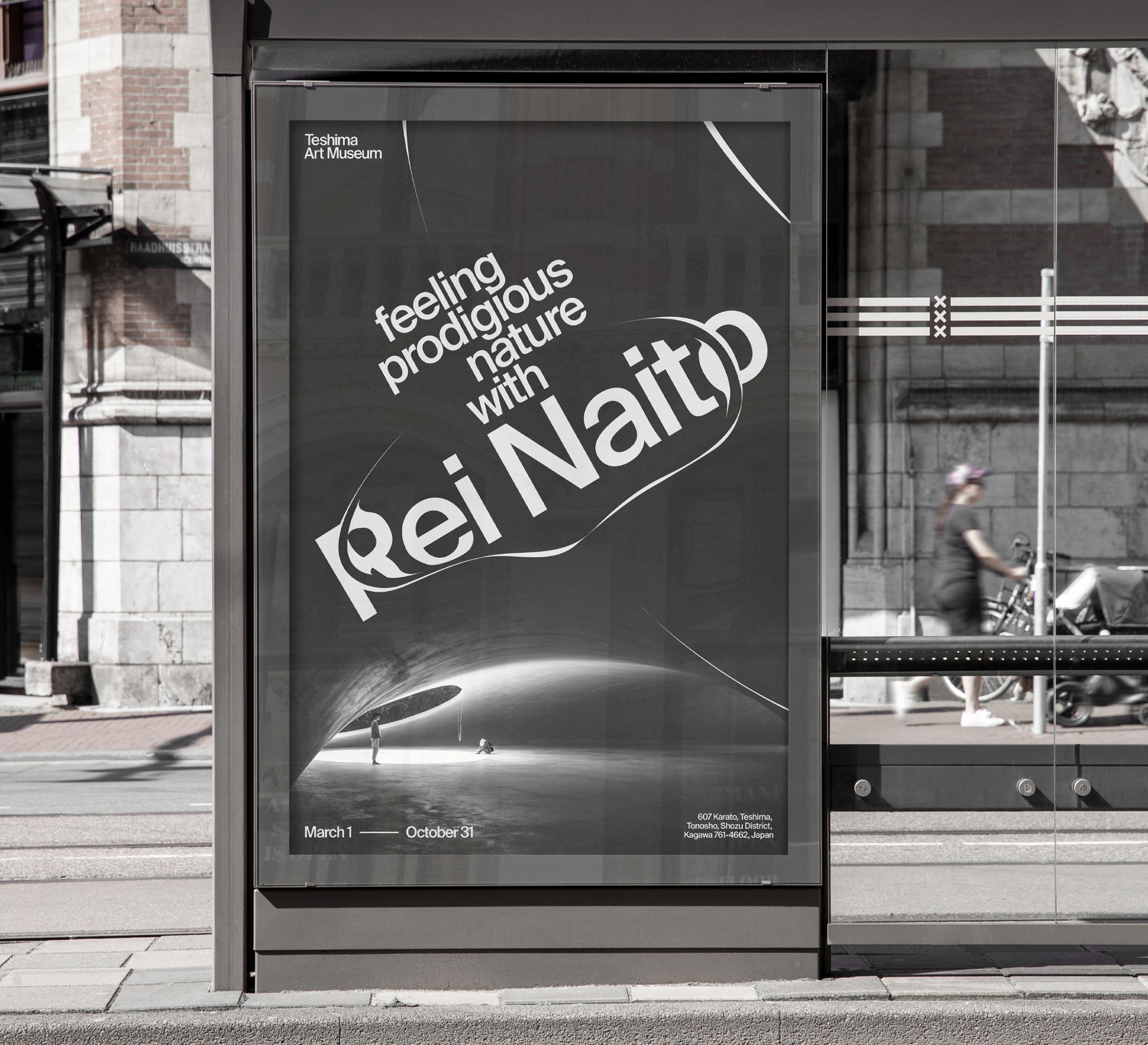
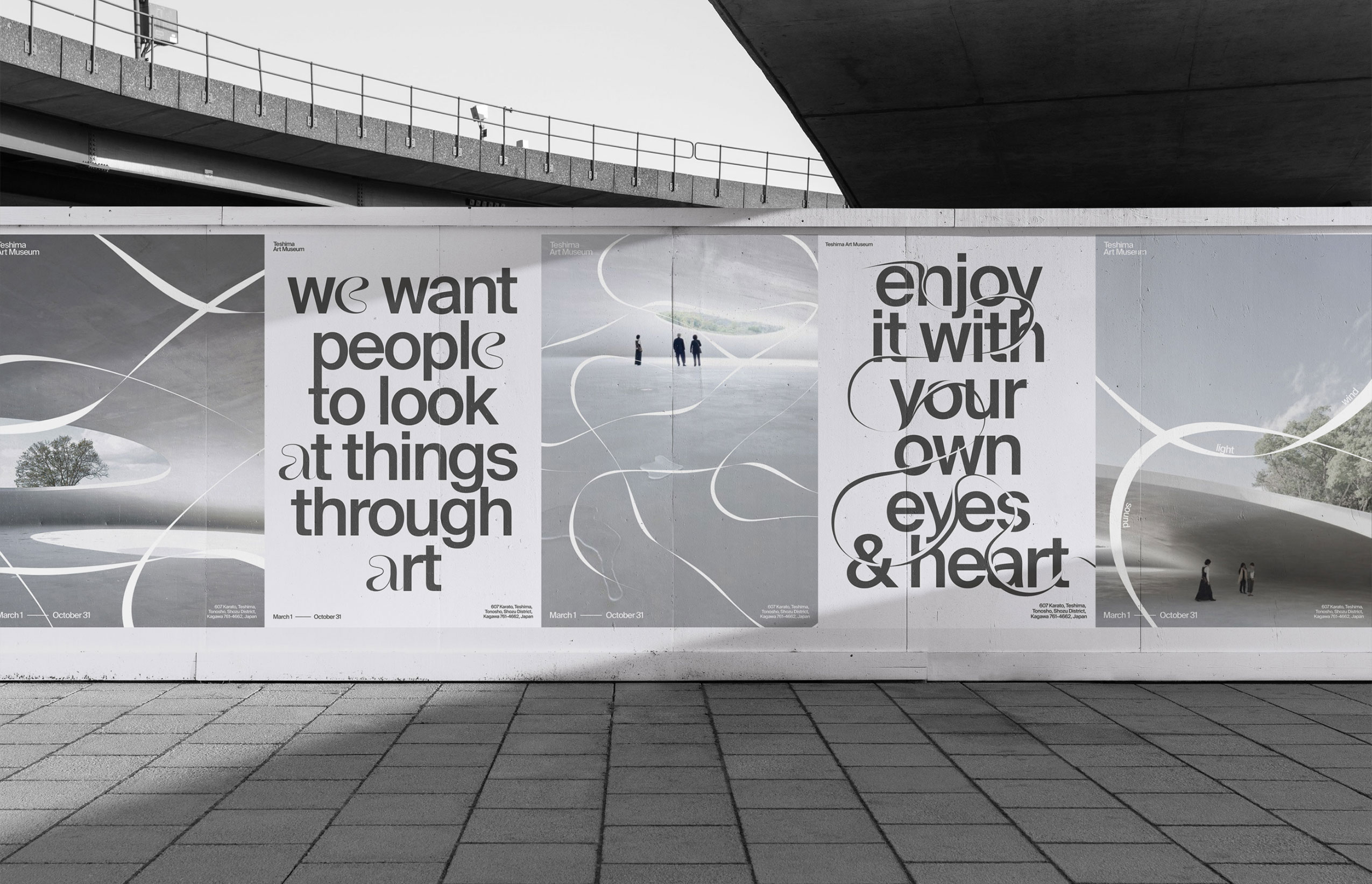
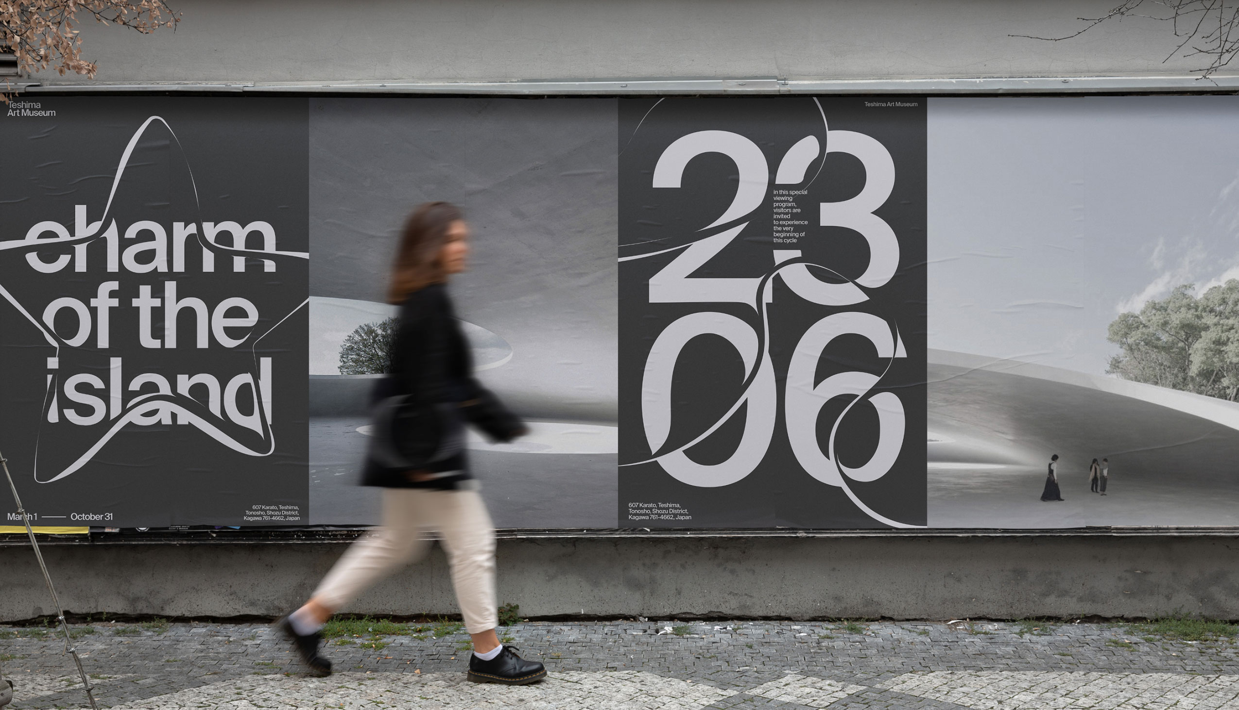
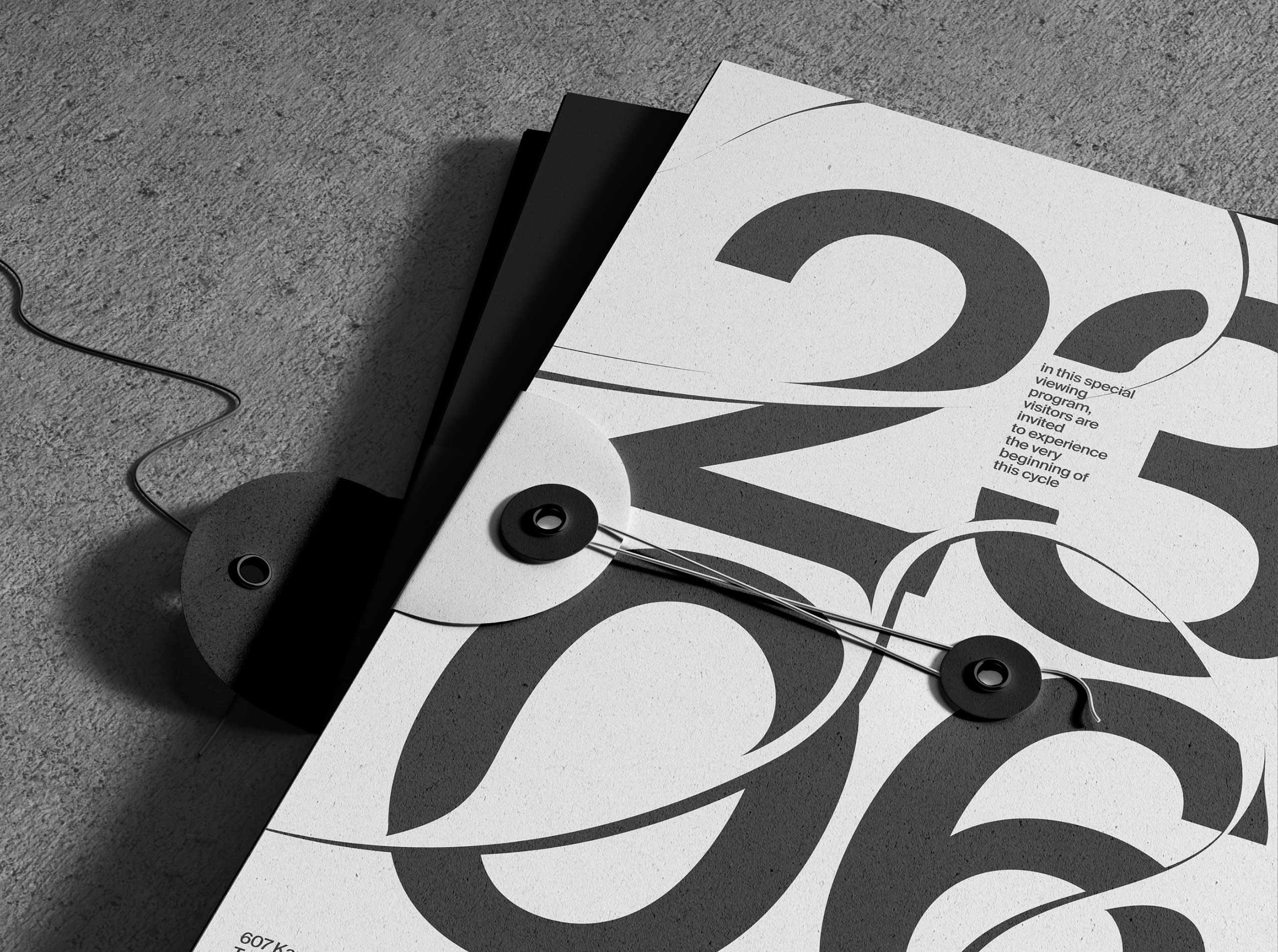
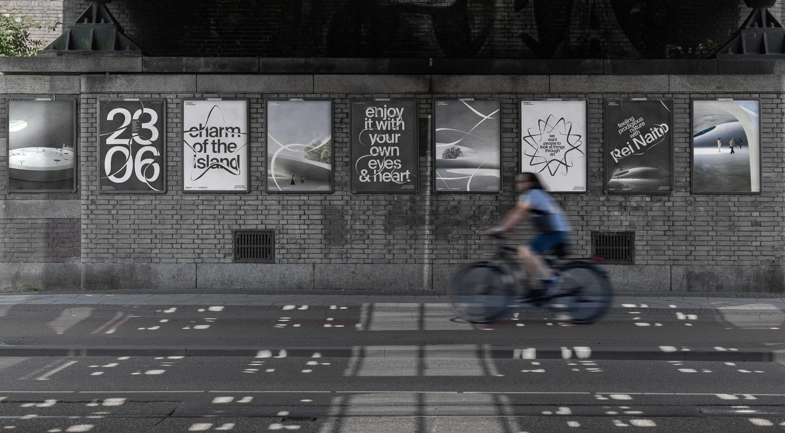
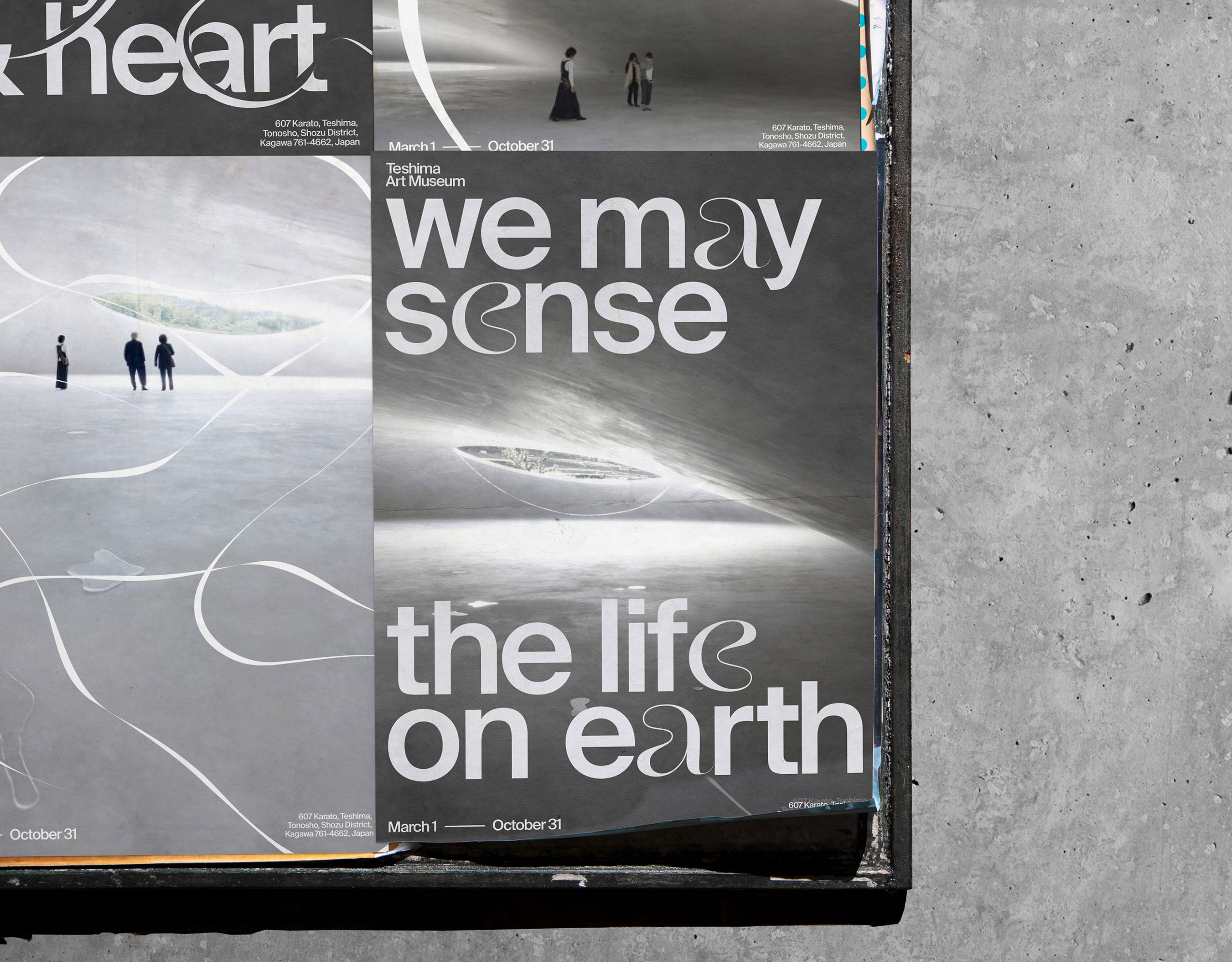
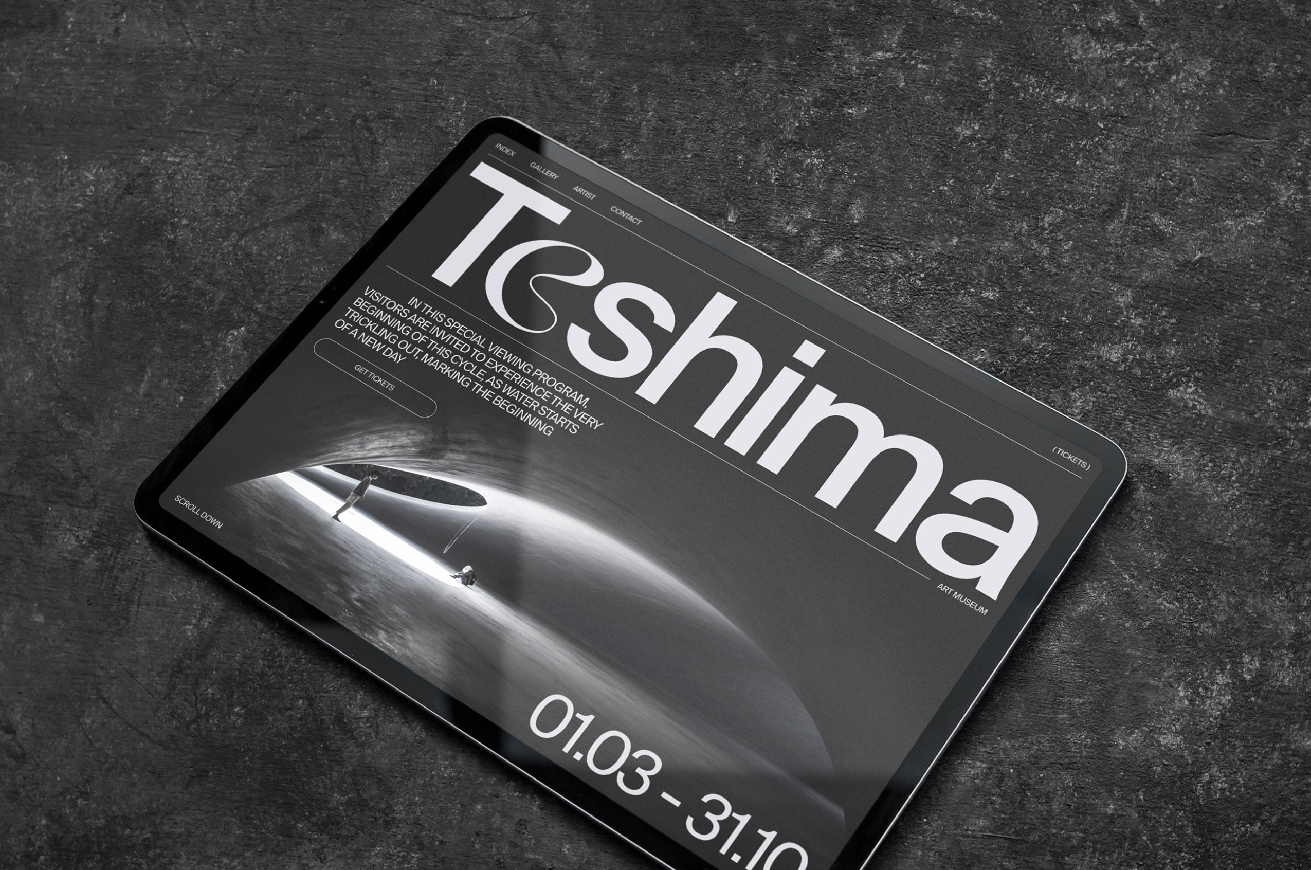
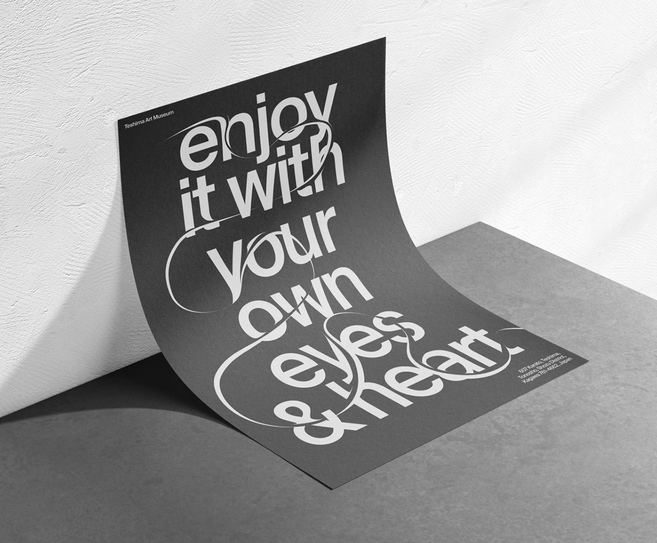
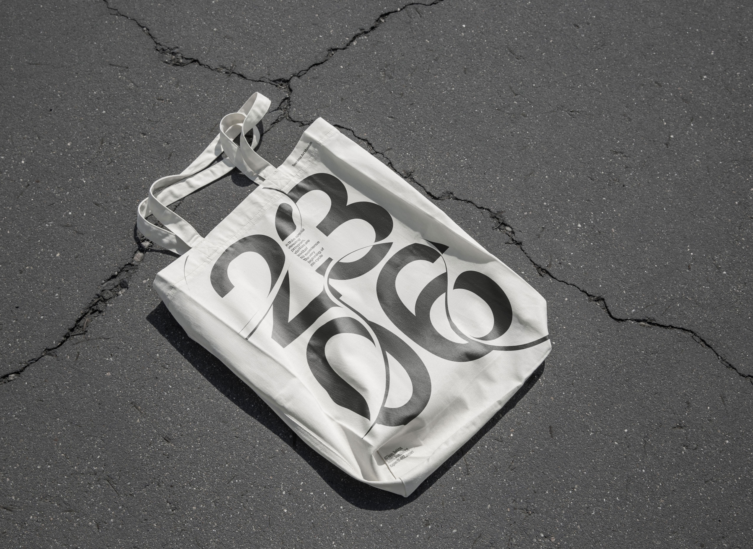
The brand identity is based on the architectural forms of the museum, elliptical openings and the movement of water inside under the influence of air, sound and gravity. This plastic has become the basis for a visual system that is embedded in typography, refracts objects and can take any shape.
